3. Data pre-processing and visualization
Learning goals
By the end of this tutorial, you will be able to:
- Inspect and prepare datasets for analysis by checking structure and formats
- Clean and pre-process data by creating variables and standardizing dates
- Merge datasets using shared keys such as state and date
- Create basic visualizations using ggplot2, including line graphs and bar charts
- Customize plots with titles, labels, and themes
- Export and save visualizations for reports or presentations
In the previous module, we explored data types and why they matter. R does not always import variables in the format you expect. For example, numbers may be read as character strings. When this happens, you must convert (coerce) the variable to the correct type before analysis and visualization.
1. Data types and coercion
2. Data management and pre-processing
This week we practice importing, merging, aggregating, and renaming variables using two datasets from the HDSinRdata package:
covidcases(weekly COVID cases)mobility(daily mobility measures)
Package documentation: https://alicepaul.github.io/health-data-science-using-r/book/working_data_files.html
# A tibble: 6 × 5
  state         county   week weekly_cases weekly_deaths
  <chr>         <chr>   <dbl>        <int>         <int>
1 California    Marin       9            1             0
2 California    Orange      9            3             0
3 Florida       Manatee     9            1             0
4 California    Napa        9            1             0
5 New Hampshire Grafton     9            2             0
6 Washington Spokane 9 4 0# A tibble: 6 × 5
# Groups: state [1]
state date samples m50 m50_index
<chr> <chr> <int> <dbl> <dbl>
1 Alabama 2020-03-01 267652 10.9 76.9
2 Alabama 2020-03-02 287264 14.3 98.6
3 Alabama 2020-03-03 292018 14.2 98.2
4 Alabama 2020-03-04 298704 13.1 89.7
5 Alabama 2020-03-05 288218 14.8 102.
6 Alabama 2020-03-06 282982 17.9 126. 2-1. Why date formats matter
Both datasets include time, but they record it differently. The COVID dataset uses a week index, while the mobility dataset uses a calendar date. Before merging, we must standardize the time variable.
Date parsing is one of the most common sources of errors in data analysis. If your merge produces lots of missing values, date formats are often the reason.
2-2. Pre-processing and merging
First, ensure values in the ‘date’ column in mobility is a real Date object If it is already a Date, this will keep it as Date. If it’s a character like “2026-04-01”, this will parse it correctly.
Create a calendar date in covidcases based on the week number. Week 1 starts on 2019-12-29
Merge datasets by state and date
Rows: 77,518
Columns: 9
Groups: state [51]
$ state         <chr> "Alabama", "Alabama", "Alabama", "Alabama", "Alabama", "…
$ date          <date> 2020-03-01, 2020-03-02, 2020-03-03, 2020-03-04, 2020-03…
$ samples       <int> 267652, 287264, 292018, 298704, 288218, 282982, 282326, …
$ m50           <dbl> 10.871941, 14.345132, 14.244603, 13.083015, 14.815029, 1…
$ m50_index     <dbl> 76.92647, 98.57353, 98.25000, 89.69118, 102.38235, 126.2…
$ county        <chr> NA, NA, NA, NA, NA, NA, NA, "Shelby", "Baldwin", "Lee", …
$ week          <dbl> NA, NA, NA, NA, NA, NA, NA, 11, 11, 11, 11, 11, 11, 11, …
$ weekly_cases  <int> NA, NA, NA, NA, NA, NA, NA, 4, 1, 3, 1, 21, 2, 3, 1, 1, …
$ weekly_deaths <int> NA, NA, NA, NA, NA, NA, NA, 0, 0, 0, 0, 0, 0, 0, 0, 0, 0…Alternatively, you can also use right_join(), innter_join(), full_join()… etc: for more, see: https://alicepaul.github.io/health-data-science-using-r/book/merging_data.html
3. Data visualization with ggplot2
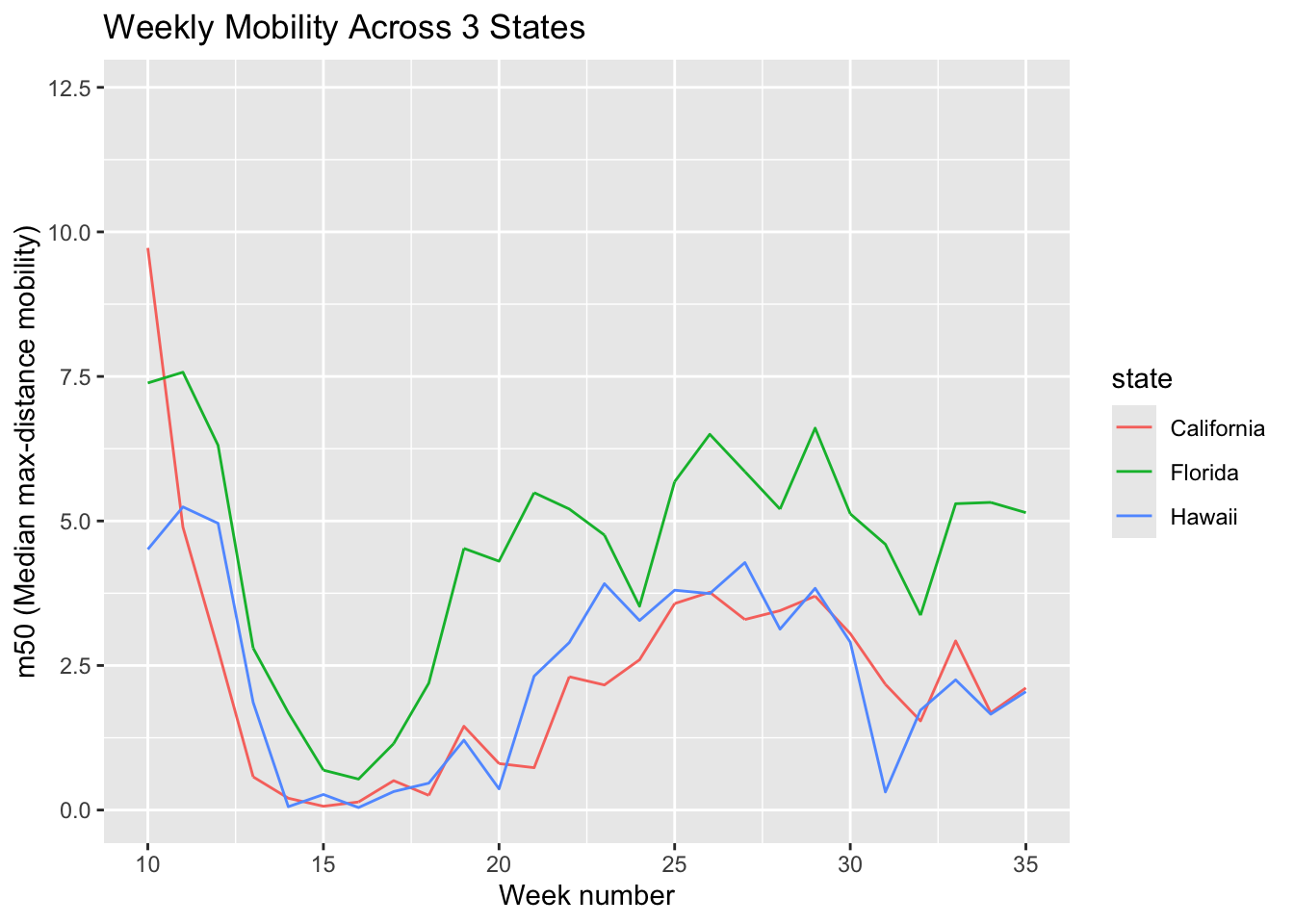
To make plots more interpretable, we often focus on a subset. Here we compare mobility trends across three states: California, Florida, and Hawaii.
3-1. Line graph: trends over time
You can add a title and label the x- and y-axes to make the plot more informative. Of note, m50 represents the median of the max-distance mobility (the distance a typical member of a given population moves in a day).
3-2. Saving plots
By default, ggsave() saves figures at 7 × 7 inches. You can change the width and height to customize the figure size.
If ggsave() does not save where you expect, check your working directory with getwd().
3-3. Customizing plot appearance
You can change the size of texts, colors/thickness/types of the lines etc by using different functions.
A. Change the size of texts (increase text size for instane)
m50trend_1 <- ggplot(filtered_data,
                     aes(x = week, y = m50,
                         color = state)) +
  geom_line() +
  labs(title = "Weekly Mobility Across 3 States",
       x = "Week Number",
       y = "m50 (Median Max-Distance Mobility)") +
  theme_minimal() +
  theme(
# Bigger title
    plot.title = element_text(size = 16,
                              face = "bold"),
# X-axis label size
    axis.title.x = element_text(size = 14),
# Y-axis label size
    axis.title.y = element_text(size = 14),
# Legend text size
    legend.text = element_text(size = 12),
# Legend title size
    legend.title = element_text(size = 14)
  )
print(m50trend_1)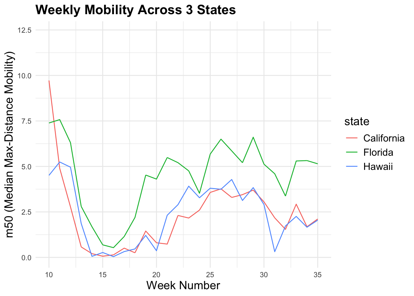
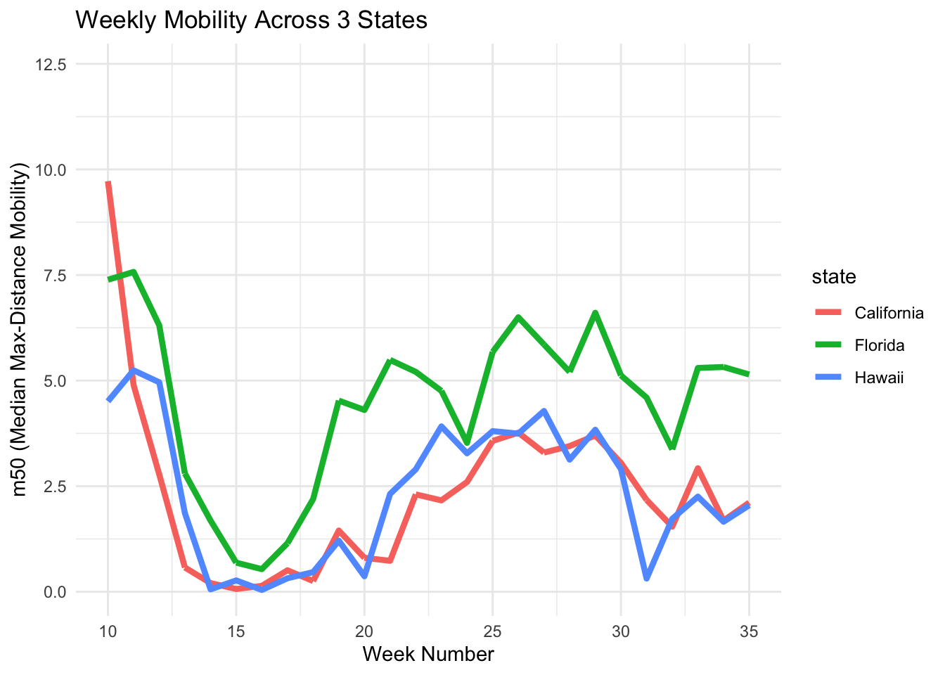
B. Change line thickness
You can adjust the number after size = to control how thick the line appears in the plot.
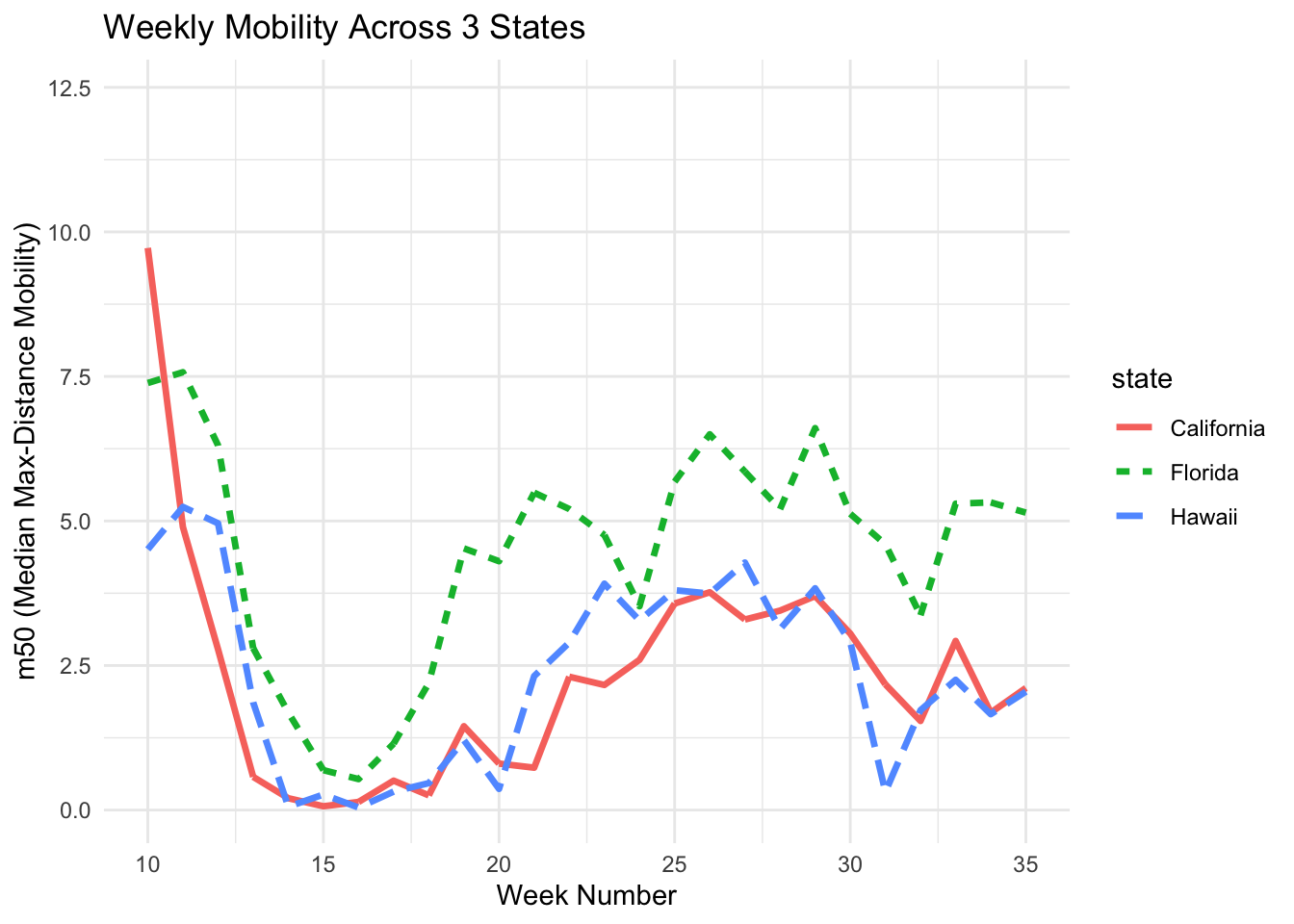
C. Change Line Type
If the figure will be printed in black and white, use different line types such as solid, dashed, or dotted to make each line easier to distinguish.
D. Assign Colors
You can use the scale_color_manual() function and enter the colors of your choice to customize the plot.
m50trend_4 <- ggplot(filtered_data,
                     aes(x = week, y = m50,
                         color = state)) +
  geom_line(size = 1.2) +
  scale_color_manual(values = c("California" = "blue",
                                "Florida" = "green",
                                "Hawaii" = "pink")) +
  labs(title = "Weekly Mobility Across 3 States",
       x = "Week Number",
       y = "m50 (Median Max-Distance Mobility)") +
  theme_minimal()
print(m50trend_4)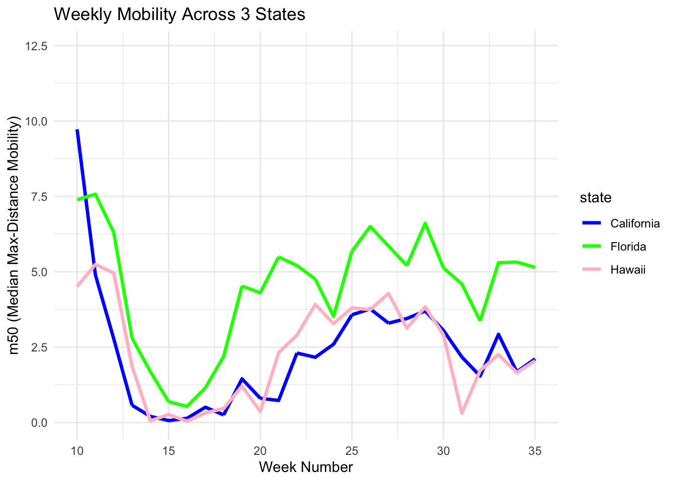
3-4. Bar graph: comparing states
Example 1. Here we calculate the average mobility for each state and then plot it. A bar chart usually use summarized data (one value per group), not raw daily rows. First, create a summarized dataset.
We now have ‘mean_m50’ scores. We enter this to ggplot and its geom_col() function.
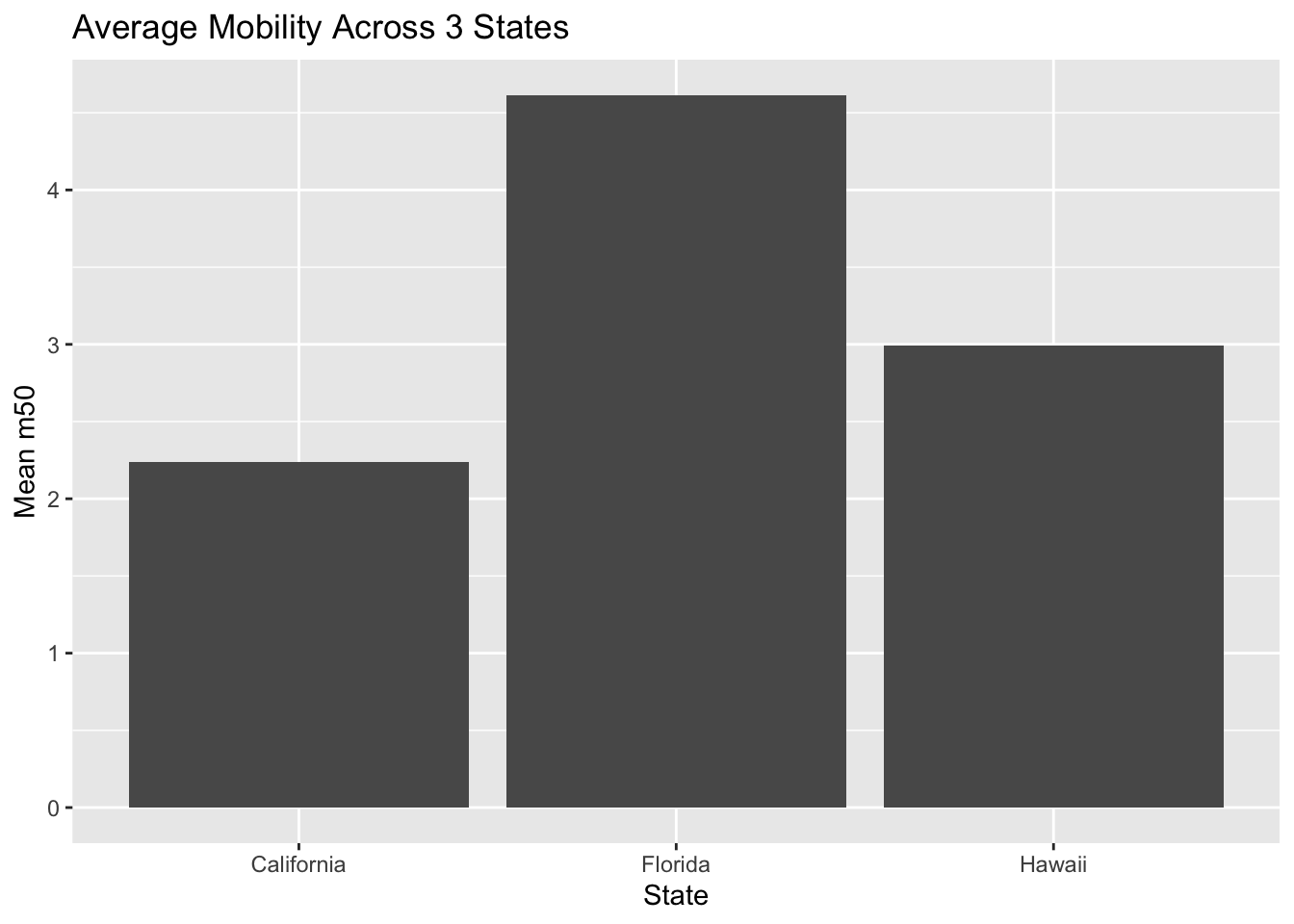
- If you already summarized your data: then use the geom_col().
- But if you want to use counts of rows: then use geom_bar().
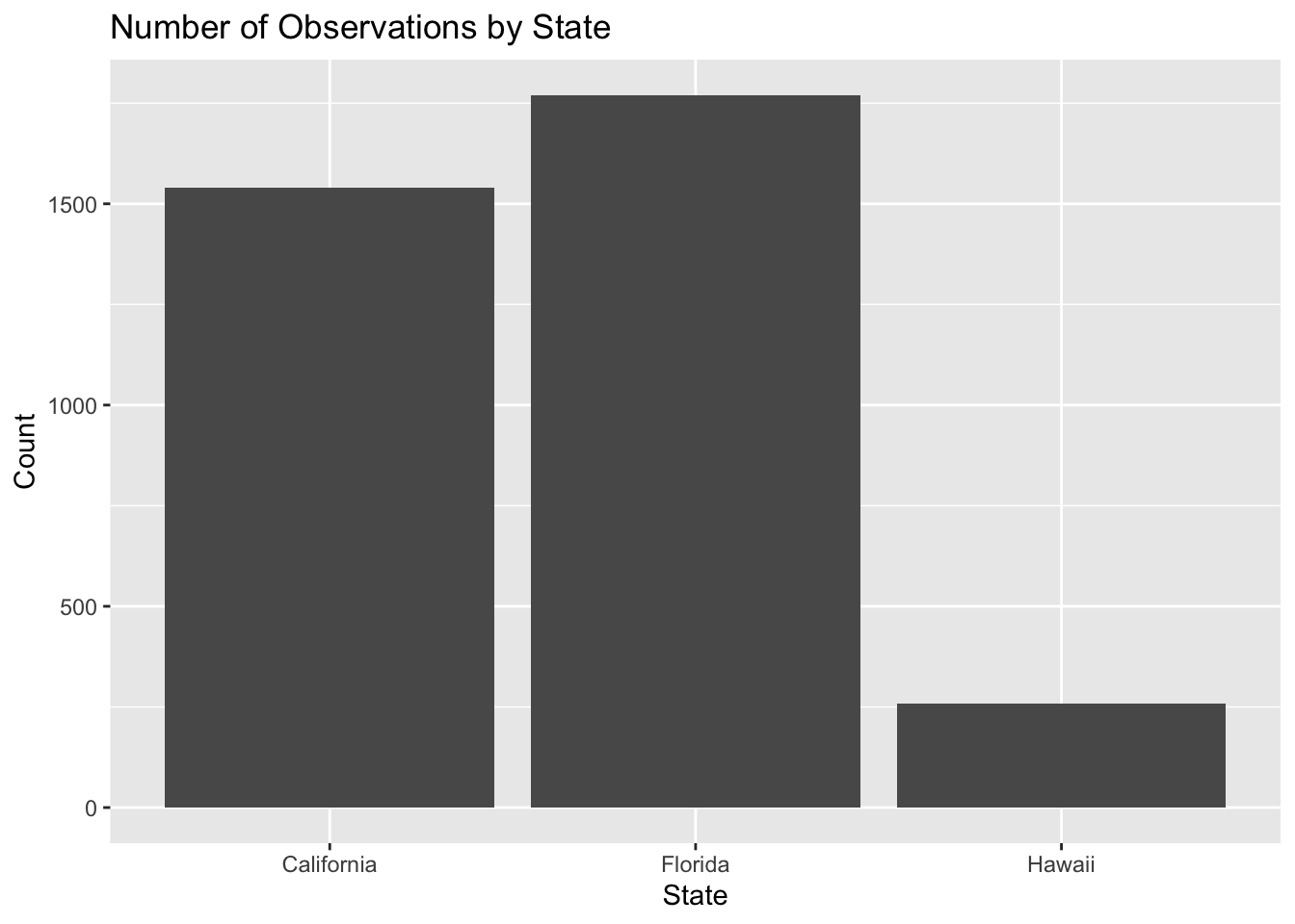
Example 2. If we want to count how many observations exist for each state, we use geom_bar(). geom_bar() automatically counts how many rows fall into each category.
4. Interactive plots with plotly
To create interactive plots, use the plotly package. Interactive plots allow you to hover, zoom, and toggle groups.
Summary
In this chapter, you practiced inspecting datasets, converting variables, and preparing data for analysis by aligning date formats and merging datasets.
You also created visualizations using ggplot2 to examine trends and compare groups. These steps (cleaning, organizing, and visualizing data) are essential for turning raw data into meaningful insights.
In the next chapter, we will build on these skills by moving from data preparation to data analysis and interpretation.